Thursday 29 September 2011

The fat man made it through...

This large guy has lasted for ever and is a great example of symbolism in branding. He's simple, versatile, fun and playful – everything you need to keep communicating all the good stuff about your brand.


His name is Bibendum or the Michelin Man and he is over 100 years old. Created by Marius Rossillon, Edouard and André Michelin, he is one of the world's oldest trademarks.


According to graphic design legend the creation of this great symbol almost didnt make it and came about through an incidental meeting:

"While attending the Universal and Colonial Exposition in Lyon in 1894, Edouard and André Michelin noticed a stack of tires that suggested to Edouard the figure of a man without arms. Four years later, André met French cartoonist Marius Rossillon, popularly known as O'Galop, who showed him a rejected image he had created for Munich brewery—a large, regal figure holding a huge glass of beer and quoting Horace's phrase "Nunc est bibendum". André immediately suggested replacing the man with a figure made from tires. Thus O'Galop transformed the earlier image into Michelin's symbol. Today, Bibendum is one of the world's most recognised trademarks, representing Michelin in over 150 countries." (Wikipedia 2011)


But surely he is testament to the leadership in the organisation to continually improve and refine this great symbol and be brave enough to carry on.


Thursday 22 September 2011

The BA way by the way

Today BA helped us all understand why it is they do what they do. But how effective is their approach to building the BA brand, shouldn't the essence be more subtle and implicit? Then a friend pointed out that Apple promoted Think Different, with Steve Jobs leading the way. Check out the link below – a more interesting approach to introducing your brand essence?


rayvellest.com
Source: Metro

Tuesday 20 September 2011

ABA in 360 degrees


We've recently been experimenting with an awesome app that allows you to create interactive panoramas on your iPhone. It can be a little tricky but is hugely effective once you get the hang of it. We've popped up a couple of our more successful attempts.


The app can be found here for anybody who wants to lose an afternoon to the world of photosynth.

Get a life

Just putting the finishing touches on a little identity for a friend who runs life coaching workshops. The identity references the process of brainstorming new ideas and new directions. Check out a video promoting their latest workshop below.

Friday 9 September 2011

Card games


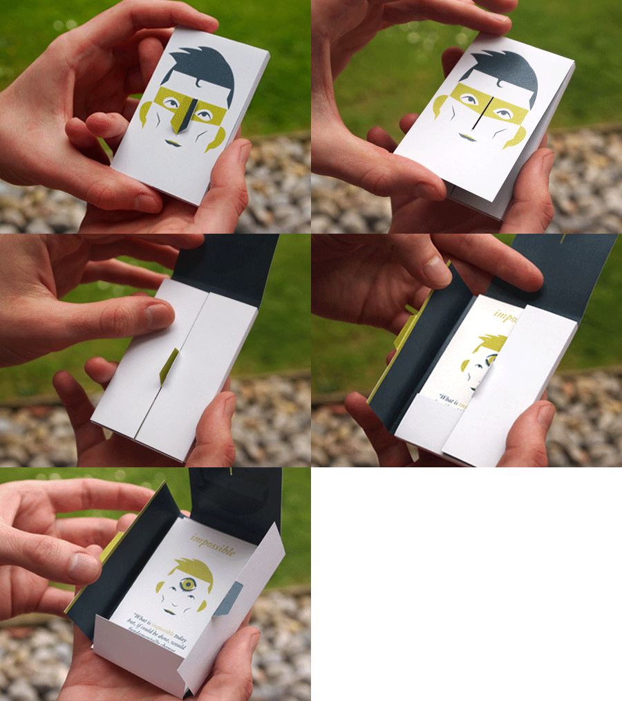
Sometimes we don't get a lot of time to explain to people how they should approach their brand. Our little leave behind pack of cards is designed keep people thinking about their brand long after we've left them.

Wednesday 6 July 2011

We're going back to university!

We are really excited to be appointed by Cranfield University to help refresh Cranfield University School of Management marketing communications. With a fresh new illustrative approach the team really focused on those 'Cranfield moments' that make the courses so successful.

Thursday 9 June 2011

A new member of the team!

We're really excited to welcome a new member of the team here at ABA – Lola! Well it may be a little while before she's opening Photoshop but designers do seem to be getting younger ;-)

Tuesday 7 June 2011

Birthday card


A good friend of mine recently found himself in need of business cards and an identity. As a birthday surprise I designed him a logo and card and had them printed and delivered to him. It's a pretty good feeling when you can positively use your profession to impact those closest to you.

Friday 3 June 2011

Keeping British Heritage alive

A few years ago we had the opportunity to get involved with branding one of the UK's greatest art heritage sites - the Stanley Spencer gallery. It was with a real sense of pride that we helped establish the gallery in the heart of Cookham; the home town and inspiration of Spencer.


With record prices for Stanley Spencer and L S Lowry claiming the headlines of last weeks 20th-century British Art auctions, having a solid home for Spencer's work is more important than it's ever been.

Wednesday 1 June 2011

The value of successfully branded charities

It’s not every day you get to visit one of your clients overseas, but on a recent holiday to South Africa I got that chance.

Arnie and Chantelle set up Oasis South Africa five years ago and live in a newly built mixed race community. (Coming from a white, middle class, English family, it’s difficult to understand the divisions that still exist in South Africa today), yet Arnie and Chantelle have chosen to go against the norm and become volunteers for Oasis, living and working amongst black communities, seeking to see people of all ages and backgrounds receive the same opportunities they were given.


The work isn’t easy, but they’re excited to tell of the developments that are taking place; from local youths now leading computer literacy classes, to the growing success of their health centre reaching ever more families with life-saving immunisation.


In a way it’s funny to think how importantly we are viewing the brand development process we are taking Oasis on. When I look at the big picture, I know it will have a great effect in bringing unity and weight to their brand, but when you’re driving through a small slum and hearing about the day to day work of the Oasis volunteers, it really puts your involvement in perspective.  Does it really matter what font or colours you use, when in reality it’s about the lives that are being transformed and the opportunities you are helping to provide in situations that seem hopeless.


And yet as founder, Steve Chalke, so clearly expressed in a meeting today, no-one is saying that this brand development is more important than the lives of individuals, but it’s a long term investment that will bring clarity and strength to the whole organisation. Which I guess really means, enabling Oasis to participate in even more amazing, life changing work!  

Tuesday 26 April 2011

Grrr

More iPad doodling

Thursday 21 April 2011

New and Exciting...

We have a new and exciting product to tell you about...

Have you ever had a thought just perfect for a blog but haven't found the time to writ it up? The problem with blogging does take time, but the product is guaranteed to help.

Here's how it works...

Set up your webcam, record your thoughts and send it to us or we can even open a live skype channel and record it then and there. We'll then transpose it, strip out the ____ and ____ and send you back a transcript and video. We can even chop your video into separate little blogs.

So, give it a go. To show you how it works we've set up a blog with Al, our founder. Check it out on the right hand navigation. If you like it, get in touch.

Monday 18 April 2011

A day of inspiration

Standing on the sidelines of the London Marathon yesterday, it was impossible not to be inspired by the thousands of individuals streaming past, red faced and sweaty, proudly carrying the name of the charity they were running for. It was also difficult not to get slightly emotional when you see “In memory of...” written on the back of a shirt, knowing that months of hard training have been endured in memory of a loved one. 

For us at ABA it is a privilege to work with so many fantastic charities. In particular to be supporting our client Oasis, including founder Steve Chalke who raised more than £2.3million, breaking his own previous record for money raised in a single marathon.


It was also fun to have introduced our Johnson and Johnson client to Oasis and be able to cheer on Mark Bangerter clad in the trademark Oasis orange, as he finished the marathon in 3 hours and 16 minutes!


All in all the London Marathon is a day to be in awe of humanity. Especially as our news is currently filled with so much pain and suffering, Sunday was a day to remind us that actually there are thousands of people prepared to commit so much to make a difference in our world. 


Wednesday 6 April 2011

Three part iPad series


When creating personal work I often struggle with the inertia needed to create images in a series. Singular pictures represent far less of a commitment and the energy needed to finish them is often generated entirely from the excitement of the concept. For me, the end of one drawing usually represents a dissolving of that excitement and the motivation to continue with an idea has to be built elsewhere. With the above sketches the excitement to persist with a theme came from the tools I was using to create. Every drawing I do on the iPad still feels like a learning experience and for me it represents the perfect time to capitalize on creating that most elusive of beasts, the three part series.


NB. Number one of the series can be seen further down the blog

Sunday 20 March 2011

Once in a blue moon


Our web clients fall into 2 camps; those that commission websites all the time and those that only commission a website once in a blue moon. This blog post rings true for projects for the latter group of clients not the former.

I was having lunch with a business owner client last week and he said to me with reference to a website we built for him 4 years ago,

"You gave me what I asked for, the problem was I didn't know what I wanted."

I am happy to publicly confess this because 4 years is an eternity in the web industry. Our whole web process and skill base has been overhauled and we are a completely different organisation from then. We have new team members, and been through a full professional development programme for the existing team. However the comment made me think, and I realised the universal truth behind it. Clients often do not know what to ask for, and they will even ask for the the wrong thing. It is the job of a good agency to uncover exactly what it is that the client does want, and also to show them the power that the digital world can offer them. It is the job of the agency, not the client, to ensure that their web offering is maximised.

A key way we ensure that we give clients fantastic solutions is to build in enough time into the project to uncover client requirements properly. We can do sites at break neck speeds if needs must, but increasingly we are unashamedly building extra time at the front end of the project specifically to go over and over and over the possibilities of the project. Viewing the project from different angles, understanding exactly what it is that users want from the site, and indeed how they typically might access the information we are offering them. Working with different stakeholders to get the whole picture. For big enough projects include research. The initial phase of a project defines its success. This approach leads for better results, happier clients and a more fulfilled team.

So if you're reading this and it is almost blue moon time again - give us a call, we'd love to help you.

Thursday 17 March 2011

When an old favourite comes home

We recently met up with our friends at Sedus in their freshly refurbished showroom in Clerkenwell. This chair caught my eye amongst all the new shiny ones. A 1930’s original Sedus office chair with a lovely piece of typography on the back.


I pointed it out and was warmed inside when I heard the chairs story.
The chair had traveled a long way. Starting life in Germany many years ago it somehow found it's way to London. A couple of months ago the owner of a office in Clerkenwell was clearing out and noticed a logo on the back of an old office chair, it triggered something in his memory. Then he had a light bulb moment! As he looked out of the window and across the street below he saw the London Sedus showroom, the old chair was nearly home. And so from Germany to Clerkenwell and many bottoms in between he returned the chair back from whence it came. 

And here's Greg from Sedus just giving it a gentle test ride!


Monday 14 March 2011

One more thing...

A little something to celebrate the release of the iPad 2 last week.

Thursday 10 March 2011

Hen Corner


iPad sketch for Hen Corner

Finger painting


I've dabbled with a few different sketching/painting apps for the iPad but few have captured my attention long enough to create something of note. For anyone familiar with digital desktop sketching, iPad drawing can often be a frustrating experience. A stubby digit is much less precise than a mouse pointer and a lack of keyboard really starts to show when short cut commands have to be selected from a menu (or worse by using complicated finger gestures).
For me Adobe Ideas gets it right. It doesn't try to recreate a desktop drawing experience but rather limits the controls at your disposal in favour of a streamlined interface. You can't cut/paste, create perfect shapes, fill, scale or even draw straight lines. What you get in the absence of all that is a piece of software that genuinely feels intuitive to use with one finger. Above is my first crack at finger painting but already I feel pretty hooked by it.

Tuesday 22 February 2011

Storytelling


In a recent de-clutter, I found myself with 8 pieces of framing quality mountboard and decided to put them to good use. My personal brief was to use the 8 pieces of identically sized board (about 4" x 6") to create an illustrated story that could stand alone as a narrative piece. The above is just one of the scenes that will eventually make up the tragic tale of the misguided knight Sir Ralph.